|
|
The Art of Fresco: Colorby Sr. Lucia Wiley, CHS
The technique of true fresco painting consists in the application of earth colors, or minerals, onto the surface of the wet plaster. The palette used is practically the same as that used by the Renaissance fresco painters, and covers a complete range of color. These colors are ground in water only and are, in most cases, the same colors that Giotto and Michelangelo and the early cave dwellers used. While there are new synthetic colors being developed, if possible use natural pigments. The colors must be mineral, substances taken from the earth, as these alone will resist the alkaline action of the lime, which quickly works to destroy a color with a dye or stain base.

In creating a palette for fresco painting, the earth colors are the easiest to find. By earth colors I mean those taken from the soil -- dirt! You have all seen plowed fields that look very red, or riverbanks and caves of golden yellow. The earth pigments range through reds, yellow, brown, to a green. We all know of them as the ochres, the siennas, the umbers, any number of reds, terra verte, and others. These are clays, which owe their color to compounds of iron or manganese and iron. These can be burned at different temperatures producing an even greater variety of colors. As would be expected these are the earliest colors known to the first painters and were universally used.
 |
|
The blues, purples, and several greens are rarer. The Egyptian blue and green frits used during the classical period have been lost. Genuine ultramarine is made from the lapis lazuli, a precious stone found in Siberia and other eastern places. Ultramarine is a chemical compound in lapis lazuli. During the early Renaissance, the utmost pain was used in its preparation and it was so precious that it was generally confined to the virgins robe.
Today we also have an artificial ultramarine, also permanent but not with the quality of the genuine. It is not so subtle or true as it tends toward a violet, while real ultramarine is a most delicate and perfect blue. Another modern color is cobalt blue, an oxide of tin. The mineral cobalt was known in early times but it was not until the 18th century that they knew how to extract it from the ore. Colors such as Prussian blue or the lakes fade under the bleaching action of the lime.
|
|

|
Malachite, a copper ore, is a source for much of the green during the Renaissance -- it is too expensive now. Because of the rarity of malachite it has been replaced by viridian, a modern permanent pigment which is a combination of oxygen and chromium. We also have cobalt greens.
Black for fresco painting is ivory of bone; our white is made of lime.
Below is a list of pigments that are used in all types of painting, some are good for fresco painting, the ones which are not good are listed with an explanation as to their weakness. If there is no comment, the pigment is safe to use.
- Cadmium yellow will eventually fade
- Chrome yellow changes color
- Terra di Pozzuoli are volcanic earths and natural cements, set quickly and hard. Colors over these set poorly
- Coal tar - helio fast red - can be used
- Ultramarine blue easily attacked by acids. It has the history of not always standing up in fresco. Ultramarine has a soft glass base that the alkalinity of fresco will eventually destroy and with it the color. It can be used but should not be used in the open where coal is burned in large quantities because it becomes whitish gray.
- Black - ivory, or vine ground charcoal
- Naples Yellow of the true form is lead antomoniate which would be bad from any point of view-as a lead compound which turns brown in lime or air containing hydrogen sulfide.
- Naples Yellow made from an ochre earth color is permanent in any medium.
- Vermilion has a varying history for permanency. It has always been known to be impermanent in direct sunlight. Do not use it because of the difficulty in obtaining really good artist's vermilion.
- Cadmium Reds are more dependable chemically. Yet ideally, discard vermilion as well as Cadmiums for fresco, although the latter will pass a test for lime-proofness because the subjection to alkalinity extends over so long a period of time and tests may not show any change.
- Yellow Ochre has quite a warm lively tone and works well.
- Yellow Iron Oxide or Mars Yellow that is near the shade of Yellow Ochre but is very much stronger and hence may adapt itself well valuable.
- Venetian Red
- Burnt Ochre
- Burnt Sienna Chrome Oxide (Opaque), a very strong green
- Cerulean Blue
- Raw Sienna
- Raw Umber, must be of high quality or it turns sooty
- Burnt Umber
- Terra Verde
- Chromium Oxide
- Cobalt Blue
- Cerulean Blue
- Ivory Black (Bone Black)
Below is a list of things to keep in mind that work for a good setting of colors:
- Good wetting of wall
- Good old slaked lime
- Dry sharp sand
- Application of all coats wet in wet
- If one plaster coat has to wait for next, surface must be roughened and well wet
- Capillary attraction of surface of lime-water encouraged by using fine sand
- Don't "paddle" mortar - as ancient writers say mortar easily cracks. Color does not hold everywhere because water comes to surface in spots and color cannot get a grip there
- Colors put on late usually become darker
- Colors mixed with lime and put on too dry a ground are apt to look moldy
- With deep shadow and plain surfaces be careful in the use of lime-water - repeated workings over make surface "cloudy"
- Colors applied too thickly incorporate poorly with wall
- Colors appear to best advantage in thin layers
- Lime-wash does away with dangerous gathering of water in depression caused by tools, but make makes colors light
- Colors sensitive to alkalis must not be used (a test is to shake samples in slaked lime and water and let stand a few days)
- Efflorescence occurs with house painter's ultramarine and English red because they contain gypsum
- Ripe buttery lime is best white, color strength and binding strength
- Grind colors fresh with lime-water that has stood for sometime and become clear - not with cloudy lime-water
- Wash brushes in lime-water while painting, rainwater or river water might have impurities and bring out rust spots
- Can add lime the size of hazelnuts to all colors if you wish - not in advance of painting for more than one hour
- Many paint red underneath blues
- The freshly painted section looks dark. This is because of the wet plaster. This is why it is sometimes hard to match the color to a dried piece of painting. As the plaster dries out it becomes very white and the colors look lighter and most lustrous.
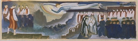
images: color sketches for Lucia Wiley's "Youth Marches On" murals, 1934
text and images © the estate of Lucia Wiley; used by permission
The Art of Fresco - Site Map
|